Letter S Minecraft: Step-by-Step Guide for Builders
Learn how to create a crisp Letter S in Minecraft using blocks, grids, and careful spacing. This step-by-step guide covers planning, materials, and scalable methods for builders at all levels.

By the end of this guide you will be able to create a clean, legible Letter S in Minecraft using a grid-based plan, chosen blocks, and careful alignment. This tutorial covers grid sizing, material choices, and step-by-step placement to ensure your S stays proportional across scales. You’ll need basic building blocks, a flat area, and patience.
Planning the Letter S: Grid, Proportions, and Scale
According to Craft Guide, successful Letter S builds start with a clean plan and a precise grid. Before you place a single block, decide the overall size you want (for example, a 5x7 grid for a small sign or a 9x13 grid for a larger mural). Draw a quick outline in your inventory by using temporary blocks that you can remove later. The goal is to keep curves proportional and avoid a lopsided look when viewed from different angles. Keep your grid aligned with the terrain so your S remains balanced as you move around the build. Use contrasting blocks for the grid lines to visualize spacing more clearly and reduce guesswork as you work.
Craft Guide analysis shows that grid-aligned letters stay proportional when scaled, which helps maintain legibility on banners, signs, and builds. Start with a simple stencil on the ground using temporary blocks, then transfer the pattern to your final material. If you’re new to lettering, begin with a smaller size to nail proportions before attempting larger scales. Remember that consistency in block size and spacing is more important than fancy materials at this stage.
The Craft Guide team recommends a three-step planning method: (1) choose a grid size, (2) map the S onto the grid with a clear spine and curved segments, and (3) test visibility by stepping back to evaluate legibility from different distances. This discipline reduces rework and keeps your S neat. In many builds, the first iteration establishes the backbone; adjustments can be made in the second pass to refine curves and width.
Materials and Color Schemes for Letter S
Selecting the right blocks is key to a clean, readable S. For classic, high-contrast signs, white concrete or quartz blocks provide crisp edges. If you’re aiming for a textured look, consider gray concrete, stone bricks, or stone to give the S a more rugged appearance. You can also experiment with colors by outlining the S with a bold border color, then filling the interior with a fill block that matches your project’s theme. Consider lighting as well—place glowstone or sea lanterns behind or around the S to ensure visibility at night or in darker builds.
When choosing color schemes, ensure the interior fill and the outline contrast well against the background terrain. For pixel-art style, you might use a limited palette and emphasize the S silhouette with a dark outline. Always test against the environment where the S will be placed—grass, sand, or snow can drastically change perceived brightness. Craft Guide analysis suggests that consistent edge treatment (a defined outline or shadow) makes letters legible across different viewing angles.
Mapping the S: Step-by-Step Grid Layout
With your grid chosen, place the spine of the S first—a vertical or slightly curved line that anchors the letter’s vertical dimension. Then outline the top and bottom curves, ensuring the shapes feel balanced on both sides. Use temporary blocks to draft each segment, adjusting the curvature as you go. After you’re satisfied with the rough shape, replace temporary blocks with your final material. A grid-based approach helps you visualize curves as a series of straight segments, which is essential for accurate scaling.
Before finalizing, verify symmetry where applicable. If you’re building an S that needs to face a particular direction (e.g., signage on a wall), align the spine toward the viewer’s line of sight. Use a ruler of sorts—count blocks between vertical elements to maintain spacing consistency. When you’re ready to commit, remove all temporary blocks and replace them with your chosen final blocks. Craft Guide recommends labeling your grid positions on a nearby sign or chest to keep the plan intact for later edits.
Building Techniques: Layering and Edges
Layering helps you build depth and reduces the risk of a flat, dead-looking S. Start with a base fill that defines the interior of the S, then add an outer layer to create a crisp edge. If you want a 3D effect, use two layers of blocks with a one-block indent to simulate thickness. For smoother curves, extend the top and bottom arcs by adding small staggered steps rather than trying a perfect arc in one pass. Lighting highlights the edges, making the S more legible at distance and in shaded areas.
Edges matter more than you think. A well-defined outline can make a blocky font readable from afar. If you’re using monochrome blocks, consider a contrasting outline of a different color to emphasize the shape. To keep your S crisp, always review from multiple angles: crouch down to eye level, step back to a few blocks away, and rotate around the sign to verify uniformity. The Craft Guide team emphasizes that incremental checks during construction prevent major corrections later.
Troubleshooting Common Issues
If your S looks off, re-check grid alignment and block counts. A common mistake is uneven spacing between curves and spine, which makes the letter look skewed. Revisit your plan and compare with the grid. If lighting creates glare that makes edges hard to discern, adjust by brightening the interior or adding a subtle border glow. In crowded builds, ensure the S has enough surrounding whitespace so it stands out clearly against nearby blocks. Adjusting scale or color contrast can resolve most readability problems.
Variations and Real-World Applications
The same Letter S technique can be adapted for banner designs, pixel-art signs, or large in-world murals. For banners, consider a lighter color palette and thinner outlines to fit within the banner’s aspect ratio. For pixel-art, keep the S as a grid-based icon, ensuring each block represents a pixel unit. In large builds, you might create a 3D S with extruded depth, using a lighter interior block and a darker outer shell to enhance visibility. Practical signage often uses simple, high-contrast palettes to maximize legibility from a distance.
Tools & Materials
- Base building blocks (white concrete, quartz, or grey stone)(Choose a material with crisp edges for legibility)
- Accent/outlining blocks(A contrasting color to define the S silhouette)
- Grid-outline materials (temporary blocks)(Use lightweight blocks or dirt to draft the grid)
- Scaffolding or ladders(For easier access while building tall signs)
- Lighting (glowstone/sea lanterns)(Optional for visibility at night or in shaded areas)
- Measuring tools in-game (counting blocks)(Keep a notebook or chest with your grid measurements)
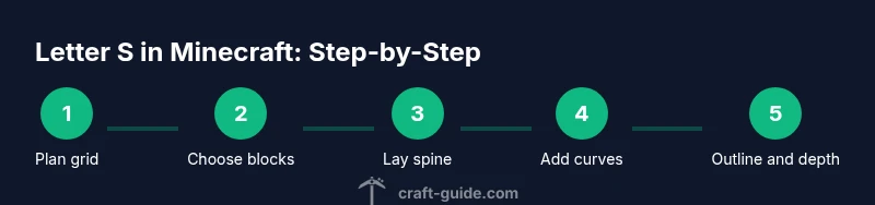
Steps
Estimated time: 40-60 minutes
- 1
Plan your S grid
Decide the target size (for example 5x7 or 9x13) and sketch a rough outline with temporary blocks. Confirm proportions by measuring edge lengths and spine length. Establish a baseline so all curves will align with the grid.
Tip: Mark the grid corners with a distinct block color to prevent mix-ups later. - 2
Choose materials and color
Select final blocks for the interior and outline. Test contrast on the actual terrain background to ensure legibility at a distance. If possible, place a border color around the S to make it pop.
Tip: Keep final color choices consistent with the build’s theme for cohesion. - 3
Lay out the spine and curves
Place the central vertical spine first, then outline the top and bottom curves using the grid as a guide. Use 1:1 block units to approximate curves with stepped edges, adjusting as needed.
Tip: If you must, draft it in stages and verify each segment before continuing. - 4
Refine the curvature
Add blocks to smooth the corners of the S and sharpen the silhouette. Replace temporary blocks with the final material as you progress. Double-check for symmetry and balance.
Tip: Treat curves as a series of small segments rather than a single arc. - 5
Add depth or outline
If you want a 3D effect, layer a second block behind or around the outline to create shadow and depth. Ensure the outer shell aligns with the interior shape and maintains readability.
Tip: A subtle outline often improves legibility against complex backgrounds. - 6
Test from multiple angles
Walk around the S, view from the front, sides, and from a distance to confirm visibility. Make final tweaks to spacing and color if edges blur or look off-center.
Tip: Always check in night and day lighting to ensure the S reads well under all conditions.
People Also Ask
What materials work best for a crisp Letter S in Minecraft?
White concrete, quartz, or light gray stones produce crisp edges and high readability. If you want texture, pair a textured fill with a contrasting outline to keep the silhouette clear.
Crisp edges come from light, solid blocks like white concrete or quartz, paired with a contrasting outline for readability.
How big should my Letter S be for a sign vs a mural?
For signs, a small 5x7 grid is usually sufficient. For murals or banners, scale up to around 9x13 or larger, keeping the grid consistent so the curves stay proportional.
Start small to nail the proportions, then scale up while keeping the grid and spacing consistent.
Can I customize the font style of the S?
Yes. You can vary edge width or add a bold outline to emulate different font weights. Keep the inner fill consistent so the shape remains recognizable.
You can simulate different font weights by adjusting the outline and edge thickness, but keep the inner fill uniform.
Is a 3D S more readable than a flat S?
A 3D S can stand out more, especially on darker terrain, but it requires careful depth planning to avoid overcrowding and losing the silhouette at distance.
A 3D S pops more, but plan depth carefully so the silhouette stays clear from afar.
What should I do if the S looks skewed after finishing?
Double-check the grid alignment and counting. Minor edge corrections on one side can fix overall skew. Revisit the spine and curves and adjust with small block shifts.
If it looks off, re-check your grid and make small adjustments to the spine and curves.
Watch Video
The Essentials
- Plan with a grid to maintain proportions
- Choose high-contrast blocks for readability
- Build the spine first, then the curves
- Test from multiple angles to verify legibility
- Experiment with depth for a stronger silhouette